Many of us work in environments where the question “when will you be done with X?” matters. Some of the examples I have seen recently are:
- The business team wants a certain set of functional enhancements as well as performance & scalability improvements. Can we get both done? Will one need to take a back seat to the other?
- A customer has a “deployment window” that we want to hit with a certain set of functionality. Do we look like we will make it? If not, what adjustments might we make?
- A customer wants an early warning if the cost of a project is likely to go over a certain amount.
One of the tools we have in our repertoire for answering these kinds of questions is the humble build-up chart.
In its simplest form, the build-up chart looks something like this:

- The target scope (of which we are asking the question: when will it be done?) is represented by a target line, in this case, just below 150 points.
- The progress so far, and anticipated progress, are represented by a line representing the cumulative points completed.
- The intersection of these two lines gives us a projected completion date. (Which, given the cost of the team(s) working on the project, also gives us an estimated cost).
- What is actually completed.
- What our recent velocity tells us about how quickly we will continue to complete.
- Variations in the target scope.
An example is shown below:
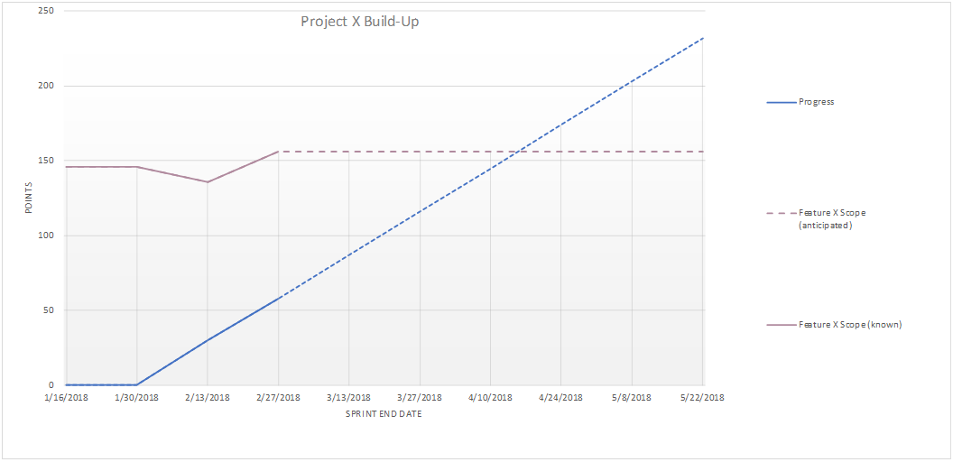
Here, we see:
- In the 2/13 sprint, the target scope dropped (maybe a story was removed), and then in the next sprint, scope was added.
- Progress in the 2 sprints was slightly less than anticipated, and the projected velocity was adjusted accordingly.
- The projected completion date moved out.
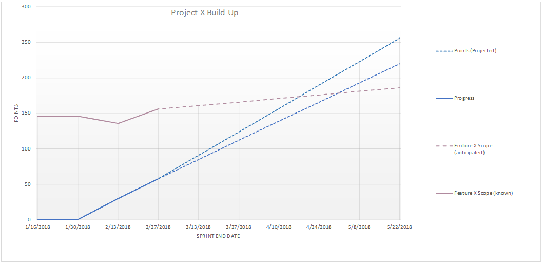
Accounting for discovery
Even in a project that is “well specified”, we usually encounter information along the way that leads us to work that we did not originally anticipate. Ideally, we are showing what has been done to our users and stakeholders along the way, so that we get feedback on what is most valuable to them. That feedback can result in additional work. (And, it can tell us what work we thought was needed that is not valuable!) Also, working with unfamiliar technologies and design patterns can generate learning (and additional work). One way of expressing this is to give the anticipated scope an upward trend. This is illustrated below.
Here we see that the anticipated scope line has an upward trend, and the projected completion date has moved out.
Note that we can make the slope of this line reflect the trend of what has been experienced.
Accounting for velocity uncertainty
The velocity of a team (or teams – more on multiple teams in a moment) typically varies. With a new team, it may be highly uncertain. Some of that uncertainty can be expressed by depicting future progress as a cone, as illustrated below.
Notice how this more clearly expresses the uncertainty of the projection. (To be truly data driven, we can even use the historic velocity standard deviation to determine the size of the cone.)
Accounting for intermediate blocks of functionality
We may be tracking more than one set of functionality. This may be shown by using additional target lines on the chart.
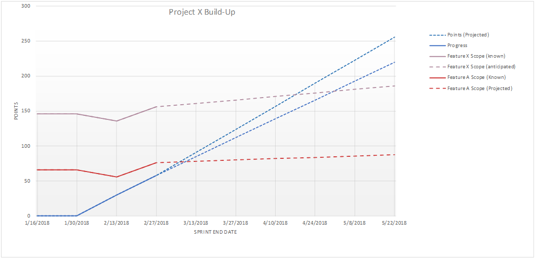
Note that the each target line represents the cumulative number of points needed to reach that target. This means that the further out target lines include the points of the nearer targets. In the example above, Feature A is sized at around 75 points, and Feature X is sized at around 80+ points. The Feature X target line is at the sum of these values, so at around 150+ points.
It’s all based on estimates and velocity
Of course, having any kind of build-up chart is based on some form of defining the work and estimating it. One lightweight way of getting started is a story-writing workshop followed by The Estimation Game or Affinity Sizing. A team can make a reasonable first pass estimate of a large body of work in hours to a day or two, depending on the size of the work. This is often enough to make macro decisions (looks like we’ll need 3 teams to get done when we want).When the work is going to an established team and is the same kind of work that the team has been doing, that team’s velocity can be used. Otherwise velocity is highly speculative (which can be illustrated with a wide cone of uncertainty). This kind of uncertainty was discussed in a previous post. Velocity estimation techniques such as those discussed in Mike Cohn’s Agile Estimating and Planning can give us a start.
Working with multiple teams
When we are showing the work of a single team, then we only have the velocity of that one team and the points estimated by that one team for the work they will complete. When we are working with multiple teams, things get messy. Velocity and points numbers across teams are usually a “local currency” – not useful to compare. We’ve used a couple of ways to address this…- Common Reference: The teams select several example “reference stories” and all teams attempt to size their stories against the same reference points. In this case, the target scope is simply the sum of the points, and the projected rate of progress is the sum of the teams’ velocities. If the teams have similar capabilities and similar work then stories can even be flowed back and forth between the teams with little impact.
- Independent Build-Ups: Each team estimates its own backlog and has its own build-up chart. This shows when each team will get done, and “projected completion” is the last team’s completion. (A tool such as JIRA Portfolio can help automate this kind of process.)
Things to watch out for…
There are a few places that we can get into trouble with build-up charts. Here are some things to watch out for:Meaningful communication
The most important thing to remember about a build-up chart is that it is a communication tool. We want our audience to be able to understand what we mean. For example, we might annotate a chart to highlight what they most care about.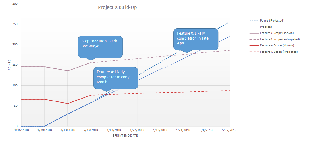
It is also useful to consider the build-up chart as a tool for transparency; if this is one of our information radiators, we will be interrupted less by anxious stakeholders wanting to know the latest status.
Points inflation
Sometimes a pre-project team does the initial estimates (e.g. Estimation Game), but a different team takes on the work; the work team does their own re-estimates (e.g. Planning Poker) sprint-by-sprint as part of backlog refinement. If the re-estimates are not calibrated by choosing representative initial stories and their estimates as grounding points, we can find that existing stories consistently get re-estimated differently (usually larger – hence the term “points inflation”). While there’s nothing wrong with this, it shows up on the build-up chart as a continuous set of point gain or loss – even if no new stories are added! The problem is that our recalibrated points show up on the build-up chart as indistinguishable from discovery.There are a couple of ways we can avoid this problem:
- Have the work team re-do all the estimates using the Estimation Game or Affinity Sizing, and use the new point totals as the target. (This can also be a great way to get the new team familiar with the overall project.)
- Have the work team choose a number of the original stories and their point estimates as reference points for any subsequent re-estimation. This should at least calibrate the estimates to reduce the effect of points inflation.
- Attempt to compute a “calibration factor” from early re-estimations and apply that to the point value of the work that has not been re-estimated yet.
Projections are not the same as commitments
Many business-people and leaders have not yet made the mindset shifts that allow them to handle uncertainty and ambiguity well. Such people are likely to look at the projections shown and use those as firm dates or date commitments. In this case we need to try to teach them what our transparency is revealing. (… and that’s well beyond the scope of this blog post!)Unestimated work
The build-up chart is only useful if the work to do (the target) has been estimated. (Some tools actually show the count of unestimated items as a separate line in the build-up chart.)Cross-team dependencies
Multi-team projections can be derailed by cross-team hand-offs and dependencies. It doesn’t take much of this to block the flow of value from a team. This is one reason to prefer feature teams.Impact can be mitigated with:
- Careful attention to how work is distributed to the teams.
- Deliberate attention and activity to identify dependencies.
- Cross-team coordination to detect and resolve impediments and blocked work.
In Conclusion
The humble build-up chart… it can be an important tool in our toolbox, for those situations where the question “when will we be done?” is meaningful. It provides us with simple transparency and effective communication.Originally published January 31st, 2019 on the Innovative Software Engineering blog. Republished with permission.
Comments
Post a Comment